Andrew Probert: Designing the 80s
Jack Atkinhawke and Seth Machwynn
Andrew Probert was born 1946 in Independence, Missouri. Without doubt, he is best known, by those people that know him at all, as the artist who created most of the designs for Star Trek: The Next Generation, including the Enterprise D, but he has contributed a great deal more to popular culture than that.
His first contribution to science-fiction was on the 1978 ABC miniseries Battlestar Galactica. As legend has it, he was recommended by artist Ralph McQuarrie himself, who is probably most famous for designing the aesthetic of the entire Star Wars universe. In an effort to capture a little of that feel and tone, Glen A. Larson hired the very same graphic artist to create the look of his show.
It remains something of a miracle that the Galactica wasn’t a variation on a big flying triangle.
Andrew Probert was responsible for the look of the Cylon warriors, treading the fine line between expressing the robotic elements necessary for the plot, and the limitations of quickly dressing men in suits at the lowest possible cost.
He was later hired to work on Star Trek: The Motion Picture, arguably making the biggest impression on the Star Trek look and design since Matt Jefferies.
Star Trek had been developed into ‘Phase 2’, an unscreened television show designed to continue the adventures of the original crew on a slightly updated ship. With the popularity and success of Star Wars, the studio wanted to cash-in and everything was quickly re-organised into a movie setting.
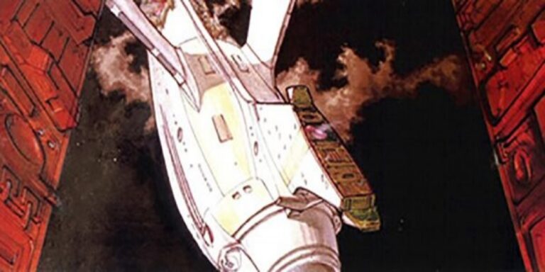
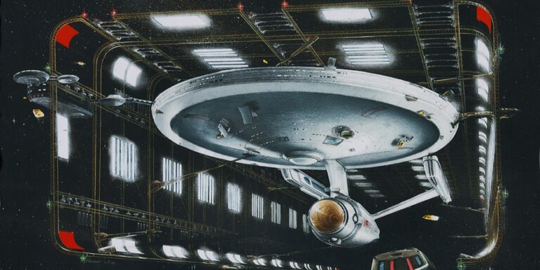
The Enterprise had been re-designed by original creator, Matt Jefferies, but on a television budget. Andrew Probert’s job was to take what they had and add enough detail to make it work on a big-screen. As well as surface detail, he added design elements to the bridge, impulse-engines and deflector array, while Richard Taylor worked on the main warp-engines.
What immediately set apart the work of Andrew Probert was his attention to detail and understanding of design elements that went beyond the visual.
His original idea for the torpedo launchers was to have them covered with doors that opened only when needed. This was to make the ship look less aggressive, keeping the tone of the vessel in line with its primary mission of exploration. Ironically, he also added the phaser arrays to the hull.
In an early episode of the show, Kirk had mentioned separating the ship and landing the saucer. With this in mind, and although it was never intended to be used on-screen, concept artwork was made of the separation-plane, and retracted landing-struts were added to the saucer design.
As well as the Enterprise, Probert designed all of the Federation auxiliary vessels, adding a sense of visual continuity to the world we see on screen.
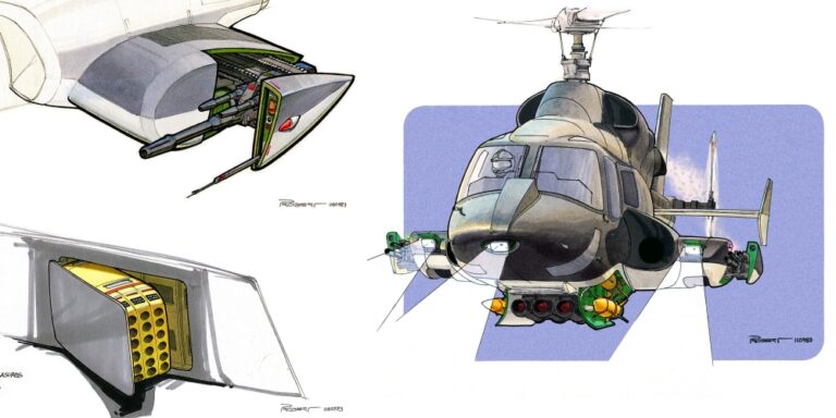
In 1983, Probert returned to television and began working on the pilot episode of Airwolf, where his remarkable attention to detail showed itself once again. He designed all the added attachments to the outside of the helicopter. This was far more difficult than it sounds, as there are, quite rightly, heavy restrictions on what is allowed to be bolted onto a flying object.
He ended up going with a pair of side-mounted engines and a panel that covered the passenger windows. He wanted to add a second set of modifications to the real engines up above the cabin, but there were just too many dangers in putting added panelling to an area where air-flow was critical.
As well as the underslung missile pod and side guns, he designed missile launchers and several other hidden details. As we often find in television productions, things were rushed along and this led to things not entirely making perfect sense. On the show, the retractable pod is referred to as a ‘cannon,’ as it was originally intended to be exactly that, with missiles fired from separate bays at the sides. The budget wouldn’t support the effects, so we always see an array of ‘missiles’ fired from the same small pod, even though it’s only about a third of the size required to house them.
Probert also commented on the telescopic barrels on the sides, something the studio insisted on which made absolutely no real-world sense. You can’t win them all!
He additionally designed the interior. He was given a hollow airframe that was eventually turned into the set. He sat in it for days with a blank sheet of paper and worked out where everything would go so that everything made logical sense.
In 1984, he returned to the big screen, working on Back to the Future. He initially began crafting storyboards, but then moved up to completing the design of the DeLorean time machine that had been started by Ron Cobb. Much like working previously on Star Trek, he added details to the overall design as the concepts were shaped to meet what could be done in the real world.
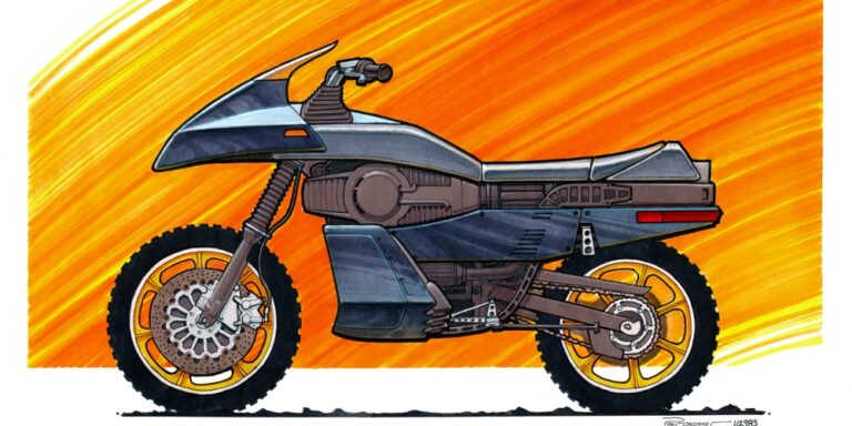
In 1984, he also designed the hero motorcycle for the pilot episode of Street Hawk. Ironically, his work on this was later redesigned for the series by Ron Cobb.
In keeping with his previous work, he was given the basic motorcycle and photographs of people sitting on it, and began working the design back from there.
It started life as a Honda XR500 offroad bike, as the suspension had to be able to handle both rough terrain and landings from stunt-work.
Probert’s original concept was ground-breaking. It started life as a turbine running through the middle of the machine that was intended in-universe to be generating electrical power. This would be fed to both wheels and could switch to provide additional thrust when required. The real world hasn’t quite caught up with this just yet.
Because of the upright position of the bike, Probert added the concept of adjustable suspension, the bike being able to morph between the upright position for cruising and manoeuvring and into a lower, more tucked-in mode for high speed running. This design-element did make it on screen in the pilot episode where the suspension is seen changing on a computer graphic display.
He also designed the seat to morph as the bike shifts to hyper-thrust. Although it was never seen on-screen, you can see the design ideas showing through on the finished bike. The rear of the chair was made to fold up, intended to hold the rider in place under the forces of acceleration.
As development continued, the producers found some cool looking gold wheels and demanded they be added to the bike, removing the idea of electric motors in the hub. Slowly, his design elements were chipped away, but what was left still looked striking enough to leave a very powerful impression.
The stunt riders said the hero bike was too heavy, prompting a redesign by Ron Cobb for the series version where the bike was moved to a lighter 250cc machine.
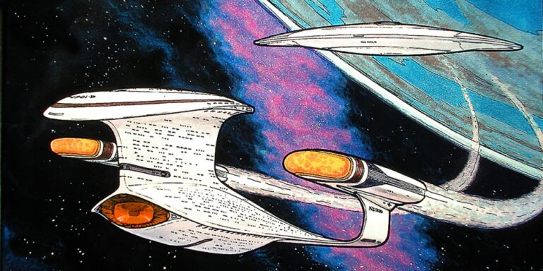
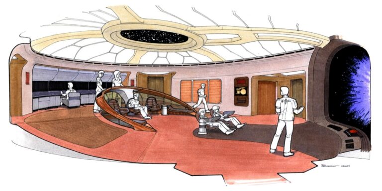
In 1986, he returned to Star Trek, this time in development of the television series, The Next Generation, where he was employed to design the bridge of the new hero starship, the Enterprise-D. Because he had a continuing burning need to go above and beyond, he began sketching what he thought the ship should look like. One of the production team saw one of his speculative Enterprise concepts and he was promoted to work on designing the starship’s exterior as well. During his one season working on The Next Generation, he also designed the exteriors of virtually every other spacecraft seen on the show, including the shuttles, the Klingon cruiser and the Romulan Warbird.
Andrew Probert contributed to Indiana Jones, Batteries Not Included and a host of other television and cinematic properties. He’s designed countless book-covers and other artwork in his long and impressive career.
In recent times, he’s slowed down, as we all do, working on smaller web-series and Trek inspired fan-productions.
Andrew Probert harkens from a lost era of cinematic and television design. He comes from a generation of artists who created icons that were striking and memorable, while also being grounded in real-world physics. He realised Airwolf as a flying lifting-body with jet engine propulsion, effectively working as a hybrid helicopter/fighter aircraft, and Street Hawk as a multi-functional pursuit bike powered by technology we still haven’t caught up with, but that looks more credible with each passing year.
He established the design parameters that created both the original Star Trek cinematic universe and the look of all future television shows. Even when J.J. Abrams produced the horrendous mess that stood in for the Enterprise, it maintained the saucer from the movie ship, almost unchanged.
Andrew Probert was one of many gifted designers who designed the futures that inspired all of us, but he continues to stand out, even in such distinguished company. It was people like these whose imaginations created the worlds our favourite stories were told against.
They are the unsung heroes of our childhood memories.
Many thanks for reading this article. We hope it was interesting, informative and entertaining. Follow us on social media or share our content on your own pages. It helps us grow so we can create more free content for you.
Want a completely free sci-fi comedy?
Rob is a ginger waiter who successfully fails at dating. Dave delivers towels. Join them on an adventure that might change the entire galaxy – but won’t – as they drink free beer and travel out to the edge of the known galaxy for reasons that barely seem worth mentioning.

